Introduction to Smart Kitchen Technologies The kitchen, often referred to as the heart of the…
Harnessing Colour Psychology to Transform Your Gold Coast Kitchen
Introduction to Colour Psychology in Kitchen Design
When embarking on a kitchen renovation or design project on the Gold Coast, one of the most crucial decisions involves selecting the right palette. Beyond mere aesthetics, the colours we choose play a pivotal role in shaping our mood, emotions, and even our culinary creativity. This is where the fascinating field of colour psychology comes into play, offering insights into how different hues can influence our daily lives.
Colour psychology delves into the emotional and psychological effects colours have on us. In the context of kitchen design, it provides a powerful tool to create a space that not only reflects personal style but also enhances well-being. The Gold Coast, known for its vibrant lifestyle and stunning landscapes, inspires a unique approach to interior design. Here, the choice of colours can capture the essence of the coastal environment, from the serene blues of the sea to the energising yellows of the sunshine.
The significance of colour in kitchen design cannot be overstated. As the heart of the home, the kitchen is more than just a place for cooking. It’s a gathering spot for family and friends, a hub of activity, and often, a sanctuary. The right colour scheme can transform this space, making it feel more welcoming, spacious, or luxurious. Whether you’re aiming for a bold statement or a subtle backdrop, understanding the psychological effects of colours will guide you in creating a kitchen that truly resonates with you and your loved ones.
In the following sections, we’ll explore the impact of warm colours in creating a welcoming ambiance, the tranquillity offered by cool hues, the timeless elegance of neutrals, and the psychological impact of various colour combinations. Each colour family holds the key to unlocking different emotions and moods, enabling you to design a kitchen that’s not only beautiful but also emotionally resonant.
Stay tuned as we delve deeper into the world of colour psychology and its transformative power in kitchen design on the Gold Coast.
Warm Colours: Creating a Welcoming Ambiance
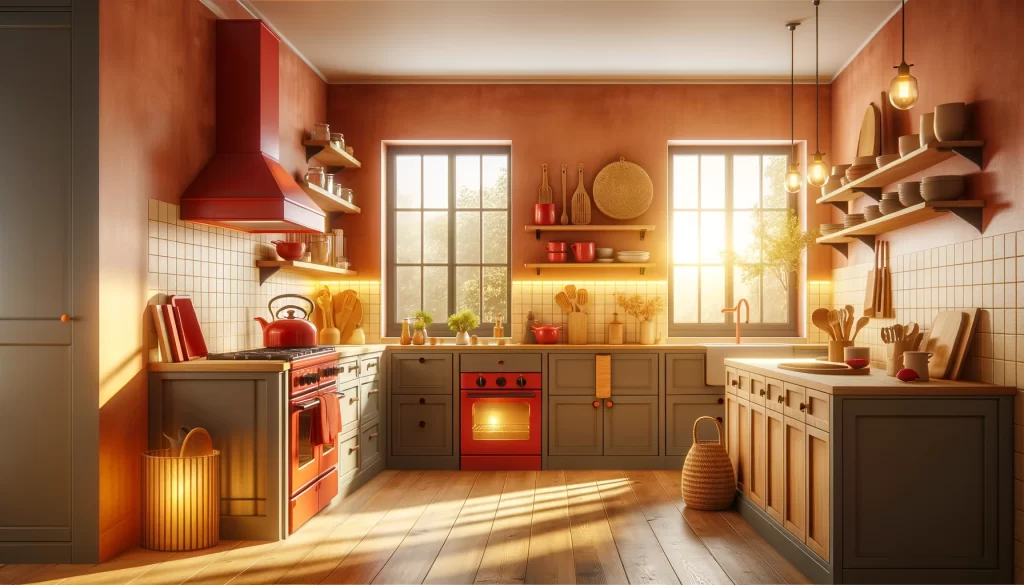
Warm colours, encompassing hues of red, orange, and yellow, are renowned for their ability to evoke feelings of warmth, comfort, and vitality. These colours draw inspiration from elements of nature such as the sun, fire, and autumn leaves, bringing an inviting and energising atmosphere into the kitchen. On the Gold Coast, where the sun and sea define the landscape, integrating warm colours into kitchen design can harmonise indoor spaces with the outdoor environment, enhancing the overall homey feel.
The Effects of Reds, Oranges, and Yellows
- Red is a powerful colour that stimulates the senses. It can raise energy levels and increase appetites, making it a popular choice for dining areas. However, it’s important to use red sparingly in the kitchen, as too much can become overwhelming. Incorporating red accents through appliances, splashbacks, or decorative items can stimulate conversation and appetite without dominating the space.
- Orange combines the energy of red with the happiness of yellow, creating a sense of enthusiasm and excitement. Lighter shades of orange, such as peach or terracotta, can warm up a kitchen without overpowering it. These hues work exceptionally well in modern and rustic kitchens alike, offering a balance between comfort and contemporary chic.
- Yellow, the colour of sunshine, is inherently cheerful and welcoming. It can brighten up the kitchen, making it appear larger and more inviting. Soft yellows work beautifully in well-lit kitchens, enhancing natural light and creating a peaceful, airy feel. Vibrant yellows, used as accents, can inject energy into the space, encouraging lively social interactions.
How to Use Warm Colours in Your Kitchen Effectively
- Balance with Neutrals: To prevent warm colours from overwhelming your kitchen, balance them with neutral tones such as white, grey, or wood finishes. This creates a harmonious look that allows the warm hues to pop without becoming too intense.
- Consider Lighting: The Gold Coast’s abundant natural light can affect how colours look in your kitchen. Utilise natural light to your advantage by choosing warm colours that complement the light at different times of the day, ensuring the space always feels welcoming.
- Add Textural Elements: Incorporating textures with warm colours can add depth and interest to your kitchen. Think about wooden cabinets, woven baskets, or textured tiles that can enhance the warmth of the colours you choose.
- Experiment with Accents: If you’re not ready to commit to bold warm colours, start with accents. Kitchen accessories, chairs, or even a feature wall can introduce warm hues without the need for a complete overhaul.
By thoughtfully integrating warm colours into your Gold Coast kitchen, you can create a space that feels both welcoming and invigorating. These hues offer a way to bring the beauty and warmth of the Gold Coast’s natural landscape into your home, making your kitchen a central hub of warmth and activity.
Cool Colours: Enhancing Calm and Serenity
In the vibrant setting of the Gold Coast, where the energy of the ocean and the expanse of the sky merge, cool colours find a special resonance in kitchen design. Blues, greens, and purples, with their calming and restorative properties, can transform a kitchen into a serene haven, offering a counterbalance to the bustling outdoor lifestyle.
The Psychology Behind Blues, Greens, and Purples
- Blue is synonymous with tranquillity and stability. It evokes images of the clear Gold Coast skies and the soothing depths of the ocean. Lighter blues can make a kitchen feel more spacious and airy, while darker shades add a touch of sophistication and depth. Incorporating blue into kitchen designs can create a calm and focused environment, ideal for cooking and socialising.
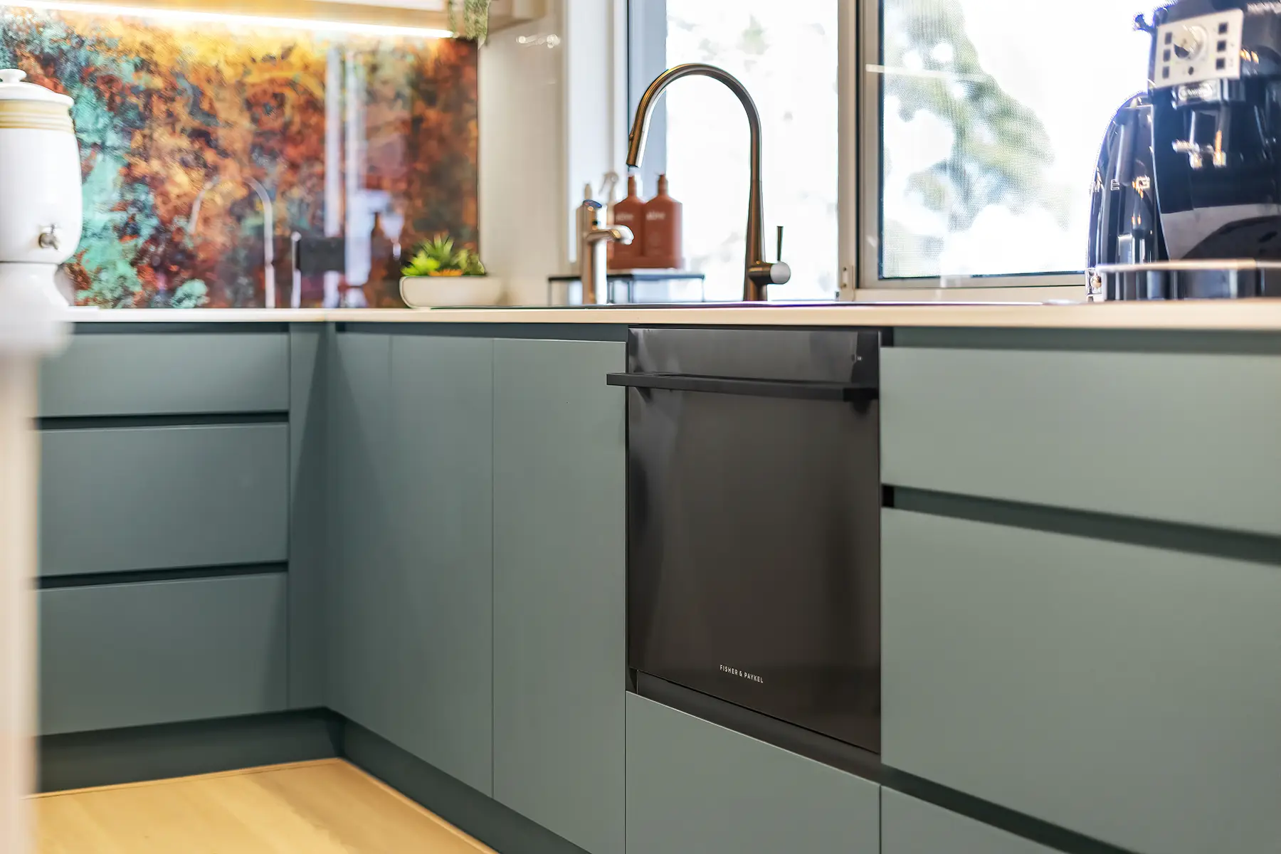
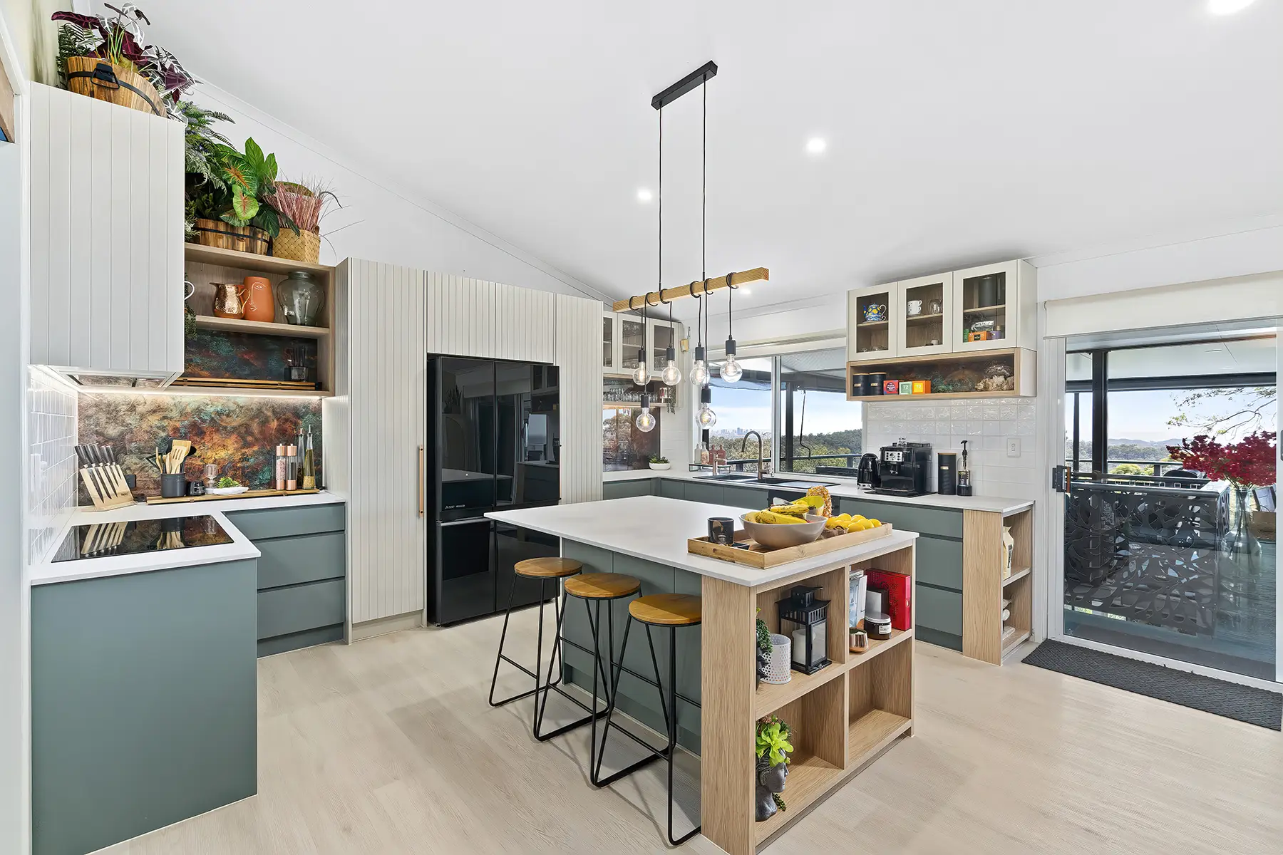
- Green mirrors the natural world, promoting a sense of renewal and harmony. It’s the colour of lush landscapes and is believed to stimulate balance and health. Using green in the kitchen can connect the indoor space with the outdoor verdure, making it feel like a natural extension of the garden or surrounding foliage. From mint to olive, green can bring a refreshing and organic feel to your kitchen.
- Purple offers a regal and luxurious feel, blending the calm stability of blue and the fierce energy of red. Lighter shades, like lavender, can soothe and calm the mind, while deeper purples inject a sense of luxury and creativity into the space. Incorporating purple into the kitchen can stimulate imagination, making it a unique choice for those who wish to make a bold statement.
Tips for Incorporating Cool Colours into Your Gold Coast Kitchen
- Leverage Natural Light: Cool colours often work best with plenty of natural light. Use large windows or skylights to enhance the serene qualities of blues and greens, making the kitchen feel more open and connected to the outdoors.
- Mix with Warm Accents: To avoid a too-cool ambiance, integrate warm accents through wood tones, metallic finishes, or even warm-coloured lighting. This creates a balanced environment that feels welcoming and dynamic.
- Use as Accents or Main Themes: Whether you prefer a subtle touch or a bold statement, cool colours can be versatile. Consider a blue backsplash, green cabinetry, or even purple accent walls to bring in the calming effects of these hues.
- Consider the Mood: Each shade and tone can evoke different feelings. Light blues and greens are perfect for a relaxed, beachy vibe, while deeper shades can create a more intimate and sophisticated atmosphere.
By thoughtfully integrating cool colours into your kitchen design, you can create a space that not only reflects the beauty of the Gold Coast’s natural landscape but also offers a tranquil retreat from the hustle and bustle of daily life. These hues encourage a peaceful and balanced atmosphere, making your kitchen a true sanctuary of calm and serenity.
Neutral Colours: Timeless Elegance and Flexibility
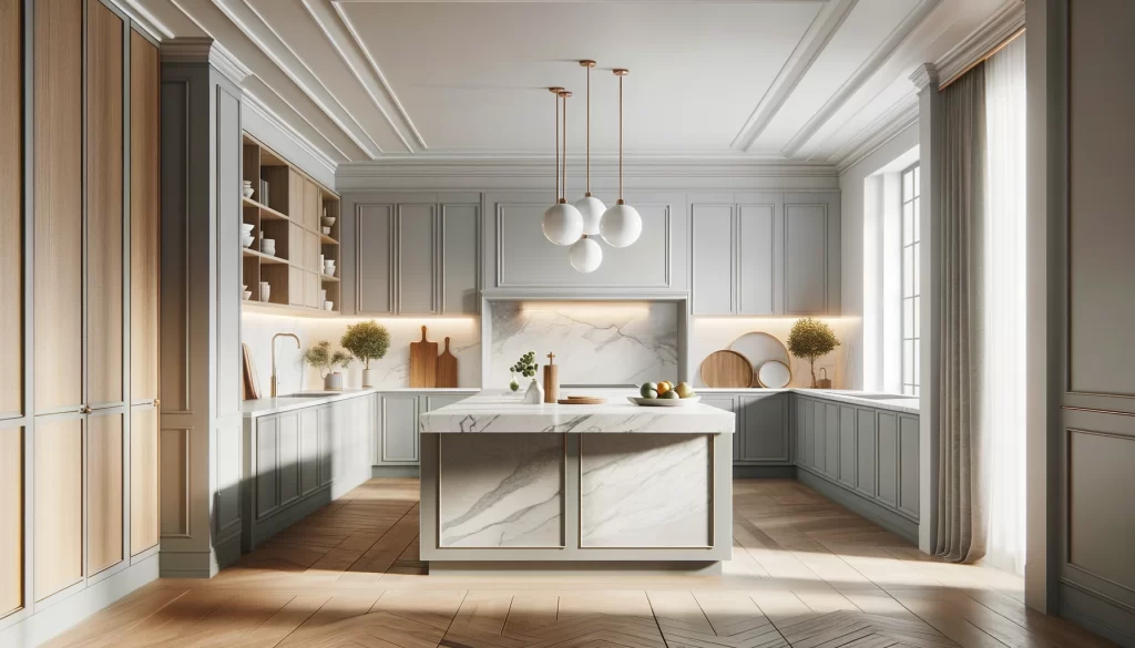
Neutral colours hold a special place in the palette of kitchen design, offering a foundation that combines timeless elegance with unparalleled flexibility. On the Gold Coast, where the natural beauty ranges from sparkling beaches to lush hinterlands, neutral tones can provide a subtle backdrop that allows these natural elements to shine through. Whites, blacks, greys, and beiges are not merely passive players; they are powerful tools to create a kitchen that is both stylish and adaptable.
The Role of Whites, Blacks, Greys, and Beiges
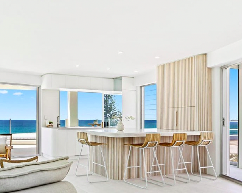
- White is the epitome of cleanliness and simplicity. It reflects light, making spaces appear larger and brighter. In a Gold Coast kitchen, white can evoke a sense of freshness and openness, reminiscent of the coastal breeze. It’s versatile, working seamlessly with both contemporary and traditional designs.
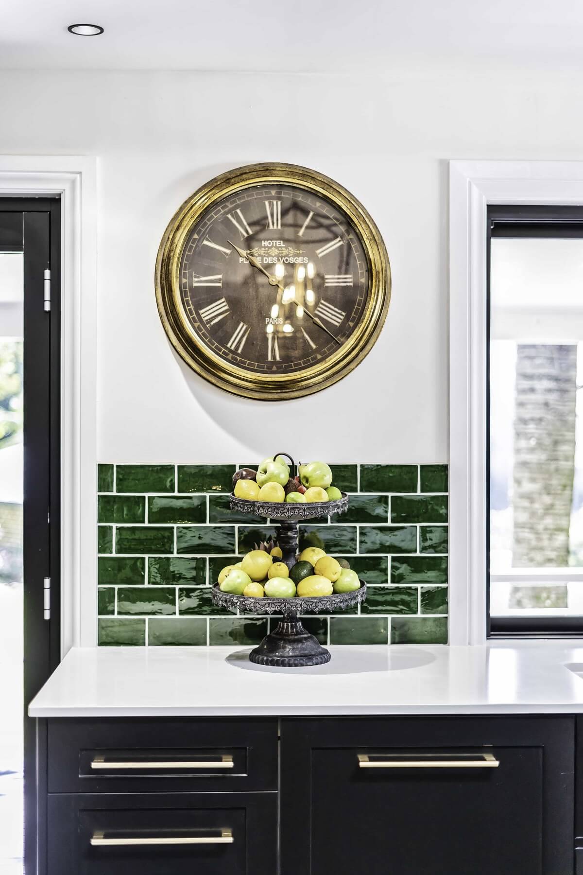
- Black adds depth and sophistication. It’s a bold choice that can serve as a striking contrast to lighter elements, creating a dynamic and modern aesthetic. Used judiciously, black can anchor the kitchen’s design, offering a focal point that draws the eye.
- Grey is the ultimate neutral, bridging the gap between black and white. Its wide range of shades, from light silvers to deep charcoals, provides a spectrum of possibilities. Grey can add a soft, understated elegance to the kitchen, offering a chic and calming space that complements the outdoor views.
- Beige and its variants, including taupe and cream, bring warmth to the neutral palette. These hues invite an organic, earthy feel into the kitchen, echoing the sandy shores and rocky landscapes of the Gold Coast. Beige tones are excellent for creating a cosy, welcoming atmosphere that remains light and airy.
Balancing Your Kitchen’s Palette with Neutral Tones
- Layer with Textures: To prevent a monochromatic scheme from feeling flat, incorporate a variety of textures. Wood grains, stone countertops, and woven fabrics can add depth and interest to a neutral kitchen, enhancing its visual appeal.
- Accent with Colour: Use neutral tones as a base to highlight bolder colours. A neutral backdrop makes vibrant accents pop, allowing for an ever-evolving kitchen design that can adapt to changing trends or personal preferences.
- Play with Light: Natural and artificial lighting can transform the appearance of neutral colours. Use layered lighting to highlight architectural features and create warmth, ensuring the kitchen feels inviting at all times of the day.
- Mix and Match: Don’t be afraid to combine different neutral shades and materials. A mix of white marble, grey cabinets, and wooden accents can create a sophisticated palette that is both cohesive and visually striking.
Neutral colours offer a canvas upon which the natural beauty of the Gold Coast and personal style can be vividly painted. By embracing the elegance and flexibility of neutrals, you can design a kitchen that is both timeless and uniquely yours, providing a serene backdrop to the vibrant life that unfolds within its walls.
Colour Combinations and Their Psychological Impact
Choosing the right colour combinations for your kitchen is not just about aesthetics; it’s about creating a space that resonates with the desired mood and functionality. The psychological impact of colour combinations can significantly influence how we feel and behave in the kitchen, making it crucial to select hues that complement not only each other but also the overall atmosphere you wish to achieve.
Innovative Ways to Combine Colours for Different Moods
- Energising and Stimulating: For a vibrant and dynamic kitchen atmosphere, consider combining warm colours like red or orange with neutral tones. This mix can stimulate appetite and conversation, making the kitchen an active hub of the home. Accents of red against a grey or white backdrop can infuse energy without overwhelming the senses.
- Calm and Soothing: To create a tranquil retreat, cool colours like blue and green paired with soft neutrals offer a serene palette. A soft blue and white combination can mimic the calm of the Gold Coast beaches, while green and beige can bring the tranquillity of nature indoors, promoting relaxation and well-being.
- Sophisticated and Luxurious: Darker hues, such as navy blue, deep green, or rich purple, when combined with metallic accents like gold or copper, can evoke a sense of luxury and sophistication. This palette is perfect for those who desire a kitchen that makes a bold statement while still providing a warm and inviting atmosphere.
- Fresh and Organic: A palette of earth tones, including greens, browns, and beiges, can create a fresh and organic feel. These colours, reminiscent of the Gold Coast hinterland, can make the kitchen feel grounded and connected to the natural world, ideal for spaces that promote healthy living and sustainability.
Case Studies or Examples of Effective Colour Combinations
- A Gold Coast kitchen that utilises a combination of soft yellow and grey to create a space that feels both bright and balanced, perfect for sunny mornings and relaxed evenings.
- Another example is a kitchen that features teal cabinetry paired with white marble countertops and wooden accents, achieving a modern yet timeless look that draws inspiration from the coastal landscape.
The psychological impact of colour combinations in kitchen design cannot be overstated. By carefully selecting hues that complement each other and the desired mood, you can create a kitchen that not only looks beautiful but also enhances the emotional and functional experience of the space. Whether you’re drawn to vibrant and energetic palettes or prefer calm and soothing tones, the right colour combinations can transform your Gold Coast kitchen into a reflection of your personal style and well-being.
Conclusion: The Transformative Power of Colour in Kitchen Design
The journey through the psychology of colours in kitchen design underscores a profound interplay between visual aesthetics and emotional well-being. On the Gold Coast, where the splendour of nature and the dynamism of coastal life enrich every living space, the mindful application of colour in kitchens becomes especially meaningful.
From the energising warmth of reds and oranges to the serene calm of blues and greens, and the sophisticated elegance of neutral tones, we have explored how each hue can dramatically transform the ambiance of a kitchen. The correct colour combinations enhance not just the visual appeal but also significantly impact the space’s functionality and emotional atmosphere.
Warm colours create inviting and lively environments, ideal for socialising and culinary adventures. Cool colours offer a tranquil haven, promoting relaxation and well-being. Neutral tones bring timeless elegance and versatility, serving as a perfect canvas for personal expression. Through innovative colour combinations, it’s possible to achieve a mood and lifestyle resonance, making the kitchen a true reflection of personal style and well-being.
Embrace Your Kitchen Transformation with BJF Joinery
Considering a kitchen design or renovation project with an eye for colour psychology opens up a realm of possibilities. It presents an opportunity to craft a space that looks stunning and feels right, enhancing daily life with the magic of colours. On the Gold Coast, where the sun’s warmth and the ocean’s call are ever-present, let your kitchen be a space that captures the essence of your home’s beautiful locale and your personal aesthetic.
As you ponder the colours that will define your kitchen, remember the transformative potential of paint, materials, and lighting. Whether you’re inclined towards bold, vibrant hues, the tranquillity of cooler tones, or the elegance of neutrals, your colour choices are a potent tool in creating a kitchen that’s not only functional but a source of daily inspiration and joy.
In closing, the psychology of colours in kitchen design transcends mere aesthetic appeal; it’s about crafting an environment that elevates the quality of life, mirroring the unique charm and vibrancy of the Gold Coast. Let the colours you select resonate with your spirit, transforming your kitchen into a space where each moment is enriched by the surrounding hues.
Discover how BJF Joinery can bring your vision to life with our bespoke kitchen renovation solutions. Explore our Kitchen Renovation services and let us help you create a kitchen that perfectly blends functionality with the transformative power of colour.
Related Posts